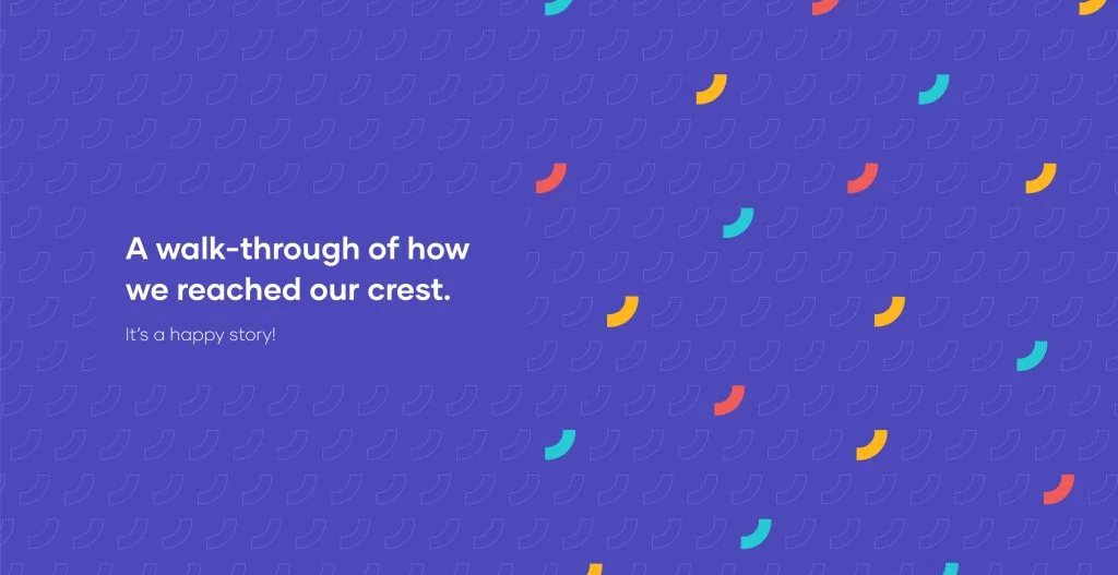
We have a new identity! Our new logo smiles at you in all its rich purple glory. Now we unpack the context of how.
Back in 2005, we began Crestech with a clear vision of bringing quality into software releases. 16 years in business, 1600 successful projects in our kitty, 300+ customers who trust us and 200+ of team members with whom we built this dream. Big numbers and a long list. Long enough for us to ask the question: what’s more?

We knew we didn’t need to look any further than inwards. Baring our raison d’etre and dissecting it to its simplistic detail. To look inwards is to ask questions like what do we mean to our clients, how does our team working with us feel? We do what we do but why? When we get past the run of the mill details, we tend to see the bigger picture. The perspective of our clients is rooted deeply in the quality of our services. To be Crestech for them is to be agile, dependable, value oriented, all ears and open-eyed. Our team mates who spend a third of their daily lives working with us, we strive to create a safe space of belongingness for them. In voice and in action. And yet, when we think of what it is that keeps us inspired everyday, what emerges so strongly is the satisfaction we drive- with the people we work, for the people we are working. It’s as simple as that. The happiness that we deliver and the faces we make smile.
“With every smile generated or delivered to a client, or a coworker, or maybe a business companion, we believe we are one step closer towards our goal”.

When we began to give form and shape to our new identity, there was so much to say and it took a series of conversations to put it all together.
From laying down our branding blocks- What do we envision ourselves to be, spelling out our brand substance- our strategy and expression, we moved from a successful discovery workshop to the next phase of the work in progress.
Over 10 hours of meetings, 15 hours of brainstorming, 5 hours of disagreements and one sweet shared moment of agreement led to giving the final keywords to infuse into different brand expressions. What dictated this all along? A deeper dig into our ideology.
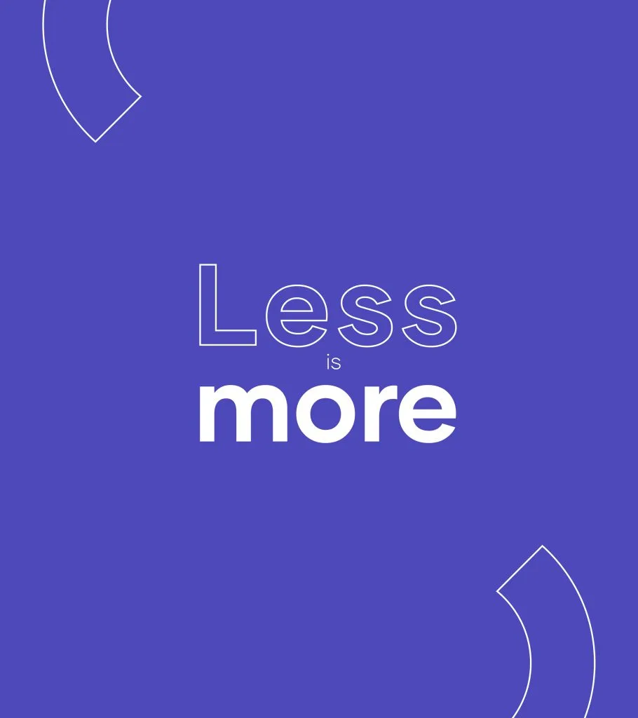
“Simplicity is better than elaborate embellishment. We have ‘less is more’ ideology as the foundational pillar of anything that comes in or goes out of Crestech”
There, we knew what’s more. For us, it’s less.
Hello world, say hi to our new crest. It’s purple. We have embraced a colour palette of soothing colours, our typeface is more flexible, we are bolder and sharper. Oh, there’s one more- we serve with a smile. Always.
We are